

A media bias chart is a visual tool that plots news sources on a grid measuring political bias (left to right) and reliability (low to high), designed to help readers identify which outlets report facts and which ones spin them. The most prominent example, Ad Fontes Media’s Media Bias Chart, uses analysts from across the political spectrum to rate hundreds of news sources every week using a detailed methodology. Sounds useful, right? Before you treat it as gospel for navigating breaking news bias there’s a catch: the May 2026 edition included exactly one Canadian source, The Maple, out of hundreds rated.
For Vancouverites trying to understand where CBC, The Globe and Mail, or The Tyee fall on the spectrum, that’s a problem. These charts have exploded in popularity as people search for shortcuts through the information chaos, but they’re built primarily for American audiences consuming American news. The methodology matters too. Ad Fontes uses trained analysts and a white paper process, which sounds rigorous until you ask who trained them, what their blind spots might be, and whether plotting complex editorial decisions on a two-axis graph oversimplifies how journalism actually works.
Here’s what you need to know: media bias charts can be a starting point, not a finish line. Understanding their limitations, how they’re made, and what they miss is just as important as reading the chart itself.
What Is the Media Bias Chart, Anyway?
Picture a colour-coded grid that claims to tell you whether your go-to news source leans left or right, and whether it’s actually reliable. That’s the Media Bias Chart® in a nutshell, and it’s the reason your group chat has suddenly turned into a debate about who reads “real news.”
The chart comes from a Colorado-based company called Ad Fontes Media, which launched the project in 2016. Think of it as an attempt to map the news landscape the way you’d plot restaurants on Yelp, except instead of rating tacos, they’re rating the trustworthiness and political slant of hundreds of news outlets. The company employs analysts from across the political spectrum who evaluate actual news content using what they describe as a rigorous, white-paper-backed approach detailed in the Ad Fontes Media methodology.
Here’s how it works in practice. The horizontal axis runs from most liberal on the left to most conservative on the right, with a middle “neutral” zone. The vertical axis measures reliability, with the highest-quality journalism at the top and clickbait, propaganda, or outright fabrication at the bottom. So a source in the top-center would be both neutral and highly reliable, while something in the bottom corners would be heavily biased and questionable at best.
Ad Fontes updates the chart regularly, they released the May 2026 edition for web and print earlier this year, and they rate international sources weekly. Subscribers can filter by country through an interactive version. For Vancouver readers, though, here’s the catch: that May edition included exactly one Canadian source, The Maple. We’ll get to what that means for us in a moment.
How They Actually Rate the News (And Who’s Doing the Rating)

So you’ve got this colorful chart in front of you, maybe shared by a friend who swears it’ll solve your information overload problem. But before you reorganize your entire media diet around it, you should probably know how the thing actually works.
Ad Fontes Media employs a team of analysts who sit down and actually read, watch, or listen to content from news sources. We’re not talking about an algorithm here, real people doing close readings. And here’s where it gets interesting: these analysts supposedly come from across the political spectrum. The idea is that if you get someone who leans left, someone who leans right, and someone in the middle all rating the same article, their collective assessment might land somewhere closer to objective truth than any single perspective could.
They follow a methodology laid out in a white paper, analyzing specific content rather than rating entire outlets based on reputation or vibes. Each piece gets scored on two axes: one measures political bias from left to right, the other measures reliability from opinion and propaganda up to fact reporting. Multiple analysts rate the same content, and their scores get averaged. It’s methodical, transparent about its process, and refreshingly honest about the fact that humans are doing the evaluating.
But let’s be real about what we’re dealing with here. You’re still asking people, however politically diverse, to quantify something fundamentally subjective. What one analyst considers neutral framing, another might see as subtle editorializing. The methodology can be rigorous without being infallible.
Ad Fontes rates international sources weekly and releases periodic editions of the chart. Their May 2026 version for web and print included sources from around the world, and subscribers can filter by country through the interactive version. The process is ongoing, evolving, and explicitly positioned as content analysis rather than some definitive pronouncement from on high.
The transparency is admirable. Knowing who’s behind the ratings and how they arrive at them matters more than the ratings themselves. But transparency doesn’t eliminate the fundamental challenge: we’re still trying to draw clean lines through messy human communication.
The Canadian Media Problem: Why We’re Barely on the Chart
Here’s the awkward truth for those of us consuming news in Vancouver: the May 2026 edition of the Media Bias Chart included exactly one Canadian source. One. Out of hundreds of outlets rated, The Maple, an independent Canadian publication, was the lone representative of an entire country’s media landscape.
Let that sink in for a second. CBC? Not there. The Globe and Mail? Nope. CTV? The National Post? Your local Vancouver Sun? None of them made the cut.
This isn’t some deliberate snub of Canadian journalism. Ad Fontes Media does rate international sources from around the world every week, and subscribers to their interactive versions can filter by country. But the popular print and web edition that’s been circulating like wildfire on social media presents a stark reality: if you’re trying to evaluate your daily news diet as a Vancouverite, this chart offers almost zero help.
The underrepresentation stems partly from resource constraints. Content analysis is labour-intensive, and rating hundreds of sources requires significant analyst time. American outlets naturally dominate because that’s where Ad Fontes Media is based and where most of their audience sits. Fair enough. But it creates a massive blind spot for readers north of the border who encounter this chart and assume it’s a comprehensive guide.
What does this mean practically? You can’t look up where CBC lands on the reliability scale. You can’t compare Global News to CTV. You certainly can’t evaluate local Vancouver outlets covering city council, housing policy, or the latest transit drama. The chart might help you understand that, say, a viral American source is unreliable, but it won’t tell you squat about the Canadian outlets filling your feed or your inbox.
This gap matters more than it might seem. Canadian media operates in a distinct regulatory environment, faces different ownership concentration issues, and covers a political landscape that doesn’t map neatly onto American left-right dynamics. Applying American-centric bias frameworks to Canadian sources without accounting for these differences is like using a map of Seattle to navigate Vancouver, superficially similar, fundamentally different, and likely to leave you lost.
What the Chart Gets Right (And Where It Falls Short)
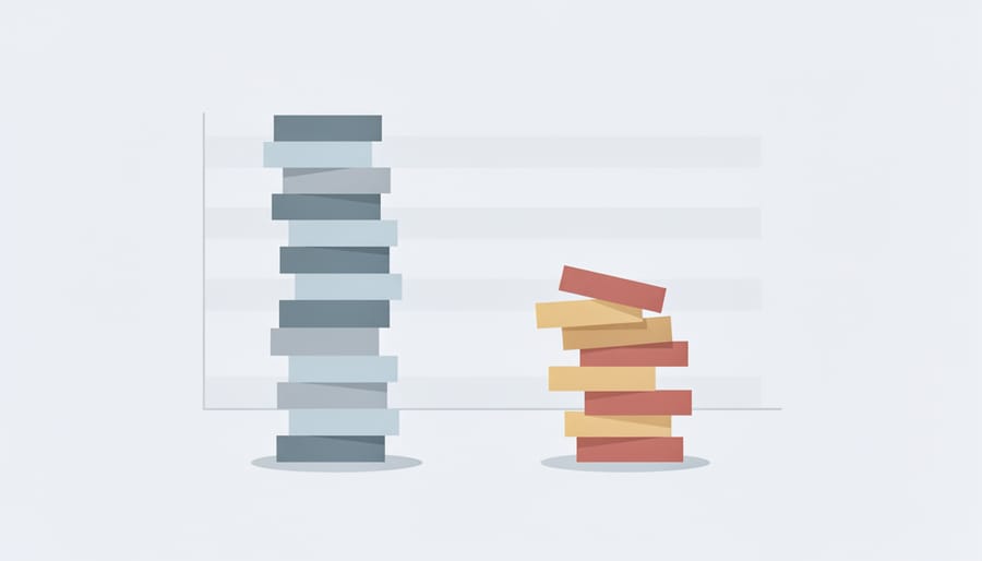
The Media Bias Chart tackles a real problem: most of us lack the time to methodically evaluate every news source we encounter. Having a quick reference that flags the most egregiously unreliable outlets does serve a purpose. If the chart stops someone from treating a hyper-partisan blog as equivalent to actual journalism, it’s done something useful. The methodology, with its spectrum of political viewpoints analyzing content, beats a single person’s gut feeling about what constitutes bias.
For readers learning to navigate media critically, the chart offers a starting framework. It normalizes the idea that sources exist on a spectrum rather than in simple “good” or “bad” categories. That recognition alone, understanding that reliability and political slant are separate metrics, represents progress over treating all media as equally suspect or equally trustworthy.
Pros
- Provides a quick visual reference for identifying extremely unreliable or hyper-partisan sources
- Encourages readers to think critically about media quality and political lean as separate dimensions
- Uses multiple analysts across the political spectrum rather than a single perspective
- Offers a structured starting point for developing media literacy skills
Cons
- Treats all political bias as equally problematic without accounting for factual accuracy differences
- Cannot capture cultural or regional context that shapes how bias manifests in different markets
- Reduces complex editorial choices and reporting quality to simple numerical ratings
- Severely underrepresents non-American sources, making it less useful for Canadian readers evaluating local news
The limitations matter just as much. No group of analysts, however politically diverse, can achieve perfect objectivity when rating subjective qualities like tone or framing. The chart’s attempt to quantify bias creates an illusion of precision that doesn’t reflect the messy reality of how journalism works. A centrist rating doesn’t automatically mean balanced coverage, and bias toward corporate interests or status quo narratives often escapes this left-right framework entirely.
More problematic is the chart’s treatment of all bias as equivalent. A source that leans left while maintaining rigorous fact-checking sources gets penalized similarly to one that peddles conspiracy theories from the right. Political lean and factual reliability are separate axes on the chart, sure, but the visual impact suggests avoiding both equally. That flattens important distinctions.
For Vancouver readers, the biggest shortcoming remains the minimal Canadian representation. The chart can help you evaluate major American outlets, but it offers almost nothing for the local sources that actually shape your understanding of housing policy, municipal politics, or regional environmental issues. Treating it as comprehensive means importing an American framework onto a media landscape it wasn’t designed to assess.
How Vancouver Readers Should Actually Use This Thing

Treat the Media Bias Chart like you’d treat Google Maps in a city you’re getting to know. It’s useful for orientation, but it won’t tell you which coffee shop has the best pastries or which shortcut floods in winter. Same goes for evaluating news sources in Vancouver.
Start by checking where your regular sources land on the chart. If you’re deep in CBC, The Province, and Daily Hive territory, you’re probably getting a certain angle on local issues. Use the chart to identify a source or two from different spots on the reliability-and-bias grid, then actually read them for a week. You’ll quickly notice what each outlet emphasizes and what it ignores.
Here’s the catch: the chart rates mostly American and international sources. When you’re trying to evaluate political claims about Metro Vancouver housing policy, Indigenous rights in B.C., or provincial healthcare funding, you need local journalists who actually cover city hall and know the players. No national chart captures that context.
So build your own informal chart. Notice which Vancouver outlets consistently cite sources, correct errors, and separate reporting from opinion. Notice who’s breaking stories versus rehashing press releases. Track who covers communities that aren’t downtown or the North Shore.
Use the Media Bias Chart as a prompt for questions, not answers. If a source you trust isn’t rated, ask yourself why you trust it. If a source you dismiss scores well, read a few pieces with fresh eyes. The goal isn’t finding one perfect outlet. It’s developing your own bullshit detector, calibrated to the city where you actually live and vote.
The Media Bias Chart is having its moment right now because we’re all drowning in information and desperately want someone to tell us what’s real. That’s fair. The appeal of a colour-coded grid that promises to sort the trustworthy from the trash is obvious, especially when your uncle is sharing conspiracy theories and your news feed feels like a Choose Your Own Adventure book where every path leads to outrage.
But here’s the thing: the chart’s virality says more about our anxiety than it does about the chart’s ability to solve it. We want a shortcut, a cheat code for media literacy. The reality is messier. No single tool, however well-researched, can replace your own judgment, particularly when you’re trying to understand what’s happening in your own city. The May 2026 edition including just one Canadian source should tell you everything about how useful it is for evaluating coverage of Vancouver housing policy or provincial politics.
Use the chart if it helps you spot the most egregious junk. But don’t outsource your critical thinking to it. Read multiple sources. Notice who’s quoted and who’s ignored. Ask whether a story reflects your community’s reality or someone else’s narrative about it. Stay curious, stay skeptical, and remember that the best defence against misinformation is not a chart on your wall but the questions you ask while reading.